A children's book lives or dies on its pictures. The text might be beautifully written, but if the illustrations don't carry the story's emotional weight, young readers put the book down, and so do the parents and educators who buy it. Book illustration is not decoration sitting next to the words. It is half the story.
Most guides to book illustration stop at the drawing. They show you how to sketch an appealing character, then leave you stranded the moment it's time to think about bleed, page turns, or converting your colours for print. That gap between artistic skill and production knowledge is where the expensive mistakes happen: colours that shift between screen and paper, low-resolution files that print blurry, characters whose faces change halfway through the book, and page turns that flatten a story that should have built anticipation.
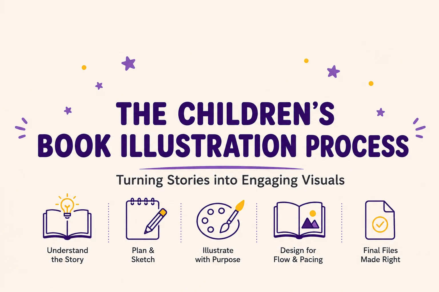
This guide closes that gap. You'll get a complete workflow for children's book illustration, from reading a manuscript for the first time through to a print-ready file, along with a practical way to choose a style, a plan for avoiding the mistakes that trip up most first-time picture book creators, and a clear path for working with (or becoming) a professional illustrator. Whether you're illustrating your own manuscript or briefing someone else to do it, you'll finish this guide with a repeatable process rather than a vague sense of what "good" book artwork looks like.
Start with what illustration is actually doing on the page, because before you choose a style or a workflow, you need to understand the job the pictures are there to do.
What Illustration Actually Does in a Picture Book
How Pictures Carry Story and Emotion
Illustrations in a picture book carry narrative weight that the words simply cannot. Facial expressions, body language, the mood of a background, the space left empty around a character: all of it tells the reader something the text hasn't said yet. Good book illustration adds information rather than repeating it.
A page that says "she was sad" becomes redundant the moment the picture already shows slumped shoulders and downcast eyes. Stronger illustration shows what the text leaves out. If the sentence is about a girl missing her grandmother, the picture might show the empty chair at the dinner table rather than the girl's face at all. That's the kind of visual storytelling that makes a book worth reading twice.
Picture and text should work in tandem, each carrying part of the load, never simply restating the other. When you're planning your book's artwork, ask what the words are not saying, and let the pictures say it.
Pacing, Page Turns and Text-Image Balance
Page turns are the punctuation marks of a picture book. Each one creates anticipation, surprise, or resolution, and a reader should genuinely want to know what's on the other side. If every spread reveals exactly what the previous page promised, the book has no rhythm.
Illustrators control pacing through the size and placement of an image, the amount of white space on a page, and the balance between full-bleed spreads and smaller spot illustrations. Text-image balance matters here too. On some pages the picture should carry the scene almost entirely; on others, the text should lead, and the illustration should support quietly in the background. Variety is what keeps a 32-page book feeling alive rather than repetitive. Too many dramatic full-bleed spreads in a row start to feel exhausting. Too many small spot illustrations in a row start to feel thin.
Age-Appropriate Visual Complexity
The right level of visual complexity depends entirely on your target reader. Board books for toddlers need bold shapes, high contrast, and familiar objects they can recognise instantly. Picture books for four- to eight-year-olds can carry more detail, visual subplots, and emotional nuance, because that age group is developing the visual literacy to follow a busier page. Early readers and chapter books use illustration differently again, more as support for the text than as the primary storyteller.
Matching complexity to age isn't just an artistic choice. It affects whether the book actually works for the reader it's written for. A gorgeous, intricate spread aimed at a three-year-old will simply lose them, no matter how technically accomplished the artwork is, because their attention naturally goes to the boldest, simplest shape on the page. Meanwhile, a seven-year-old reading independently will notice and enjoy a visual joke tucked into the background that a toddler would never register. Test your spreads against the age you're actually writing for, not the age you personally find most interesting to draw.
How Illustration Supports Early Literacy
Illustration is not just decoration for young readers; it's a scaffold for how they learn to read. Children use pictures to predict unfamiliar words, confirm what they've just decoded, and build vocabulary before they can sound out every word on the page. Visual sequencing across a book also teaches narrative structure: beginning, middle, and end, cause and effect, who did what to whom.
Consistent character design plays a quiet but important role here too. If a young reader can't tell which character is which from page to page, they lose the thread of the story before they've even worked out the words. This is one of the reasons professional book illustration work looks so deliberate: every visual choice is doing a job for the reader, not just filling space.
Choosing an Illustration Style for Your Story
Why Style Should Serve the Story First
Before you sketch anything, decide on a style, but not based on what's currently popular online. Style should serve your story's emotional core. A gentle bedtime story about loss needs a different visual language than a high-energy adventure about space travel. Style is a storytelling tool, not a costume you put on the book afterwards.
Your chosen style also becomes part of your book's identity. It's what makes the cover recognisable on a shelf next to a hundred others, so it's worth treating as a genuine creative decision rather than a default.
A Practical Comparison of Major Styles
The table below sets out the main styles used in children's book illustration today, along with where each one tends to work best.
Style | Visual Characteristics | Best-Fit Genres | Strengths | Trade-Offs |
Watercolour | Soft, organic washes; gentle colour transitions | Gentle, emotional, nature-themed, bedtime stories | Timeless warmth, unique texture, strong emotional resonance | Harder to revise, needs careful scanning and clean-up |
Digital painting | Clean lines, bold colour, precise shapes, smooth gradients | Modern, STEM, concept books, educational titles | Fast revisions, consistent characters across pages, no scanning step | Can feel cold or generic if overused |
Mixed media | Textured, layered, tactile; blends traditional and digital elements | SEL-driven, emotional, nostalgic, literary stories | Rich, distinctive, feels handcrafted and authentic | Time-consuming, harder to keep consistent across many pages |
Bold graphic minimalism | Flat shapes, strong colour, simple forms, high contrast | Concept books, board books, younger readers | Striking, memorable, prints cleanly and scales well | Can feel impersonal, limited emotional range |
Cartoon | Exaggerated features, playful expressions, dynamic poses | Humour, action, character-driven stories | Engaging, accessible, highly expressive | Can read as dated or less "literary" for quieter stories |
There's no single "best" entry on that list. The right choice depends on your story, not on what looks good in a portfolio grid.
Building a Simple Style Reference Board
Before you commit to a style, it helps to gather ten or twelve published spreads that feel close to what you're imagining, from a mix of books, not just one favourite illustrator. Look for the throughline: is it the colour palette that keeps pulling you back, the linework, the way faces are drawn, or the overall mood? Pin these references somewhere you'll see them constantly while you sketch. A reference board like this does two things at once. It stops your style from drifting halfway through a 32-page book, and it gives you (or an illustrator you're briefing) a shared visual language before a single final piece of art is started.
Matching Style to Tone and Audience
Once you understand the main options, match style to your specific book by weighing three things: the emotional tone of the story, the age group you're writing for, and your own practical constraints. A soft, tender story calls for a softer visual register. A younger age group generally needs simpler, bolder imagery than an older one. And if you've never worked in watercolour before, your first picture book is not the moment to learn it under a deadline.
If you're planning to commission the artwork rather than illustrate it yourself, it's worth researching this properly before you start browsing portfolios, since style fit is the single biggest factor in whether a commission goes smoothly. There's more detail on that process later in this guide.
Traditional, Digital or Hybrid: Choosing Your Workflow
Plenty of creators freeze at this decision. Each workflow carries real trade-offs in cost, learning curve, ease of revision, and print preparation, and the fear of wasting money and time on the wrong choice is a reasonable one. But the expensive mistake is usually made by skipping this comparison altogether, not by picking traditional over digital or the other way round.
Workflow | Typical Materials | Cost Pattern | Strengths | Trade-Offs |
Traditional | Paint, ink, coloured pencil, a good scanner | Ongoing material costs, plus a scanner | Unique texture, tactile quality, original art has resale value | Hard to revise quickly, needs scanning and colour clean-up |
Digital | A pressure-sensitive drawing tablet and layer-based illustration software | Upfront hardware and software cost | Fast, non-destructive revisions, consistent characters, no scanning step | Learning curve, and colours can shift if not managed carefully |
Hybrid | Traditional sketching finished in digital software | Combines both cost structures | Authentic texture with digital flexibility for revisions | More steps, and it demands comfort with both skill sets |
Cost and Learning Curve
Traditional media means ongoing spending on materials and no software to learn, but scanning and clean-up add real time to every spread. Digital work asks for upfront investment in a drawing tablet and illustration software, with a learning curve on the software side, but pays that back in revision speed once you're up and running. Hybrid work combines both cost structures, so it's the most expensive path to learn but also the most flexible once you've learned it.
Revision Ease and Print Preparation
This is where digital work clearly wins. Fixing an expression or adjusting a colour is a matter of layers and undo, not a repaint. Traditional media asks for careful correction or a full redo, but traditional artists usually breeze past the print-prep issues that trip up digital-only creators, since a lot of that thinking happens naturally at the scanning stage. For a digital workflow, print preparation, colour mode, bleed, and resolution have to be built in deliberately from the very first file you open.
Choosing Based on Your Story's Emotional Core
The workflow decision should serve the book, not just convenience. If your story's emotional core depends on organic texture and the small imperfections of paint or ink, lean traditional or hybrid. If your story needs precise, repeatable characters across 32 pages on a tight schedule, lean digital. If you genuinely can't decide, start hybrid: sketch by hand, finish on screen, and adjust your process once you see how the first few spreads come together.
The Step-by-Step Process: From Manuscript to Final Art
Manuscript Analysis and the Art Brief
Before you draw anything, read the manuscript several times, once for story, once for emotional beats, once purely for visual opportunities. Then build a page-by-page art brief that maps text to image, marks the emotional beat of each spread, and plans where the page turns fall. This single step prevents more rework than anything else in the process.
If the manuscript itself isn't finished yet, it's worth getting the text right before locking in artwork decisions. Purple Giraffe Press offers support with fiction ghostwriting for authors who have a story idea but need help getting it onto the page, and a solid grounding in how to write a children's book will make your eventual art brief far easier to build, since a clean manuscript gives an illustrator (or you, illustrating your own book) something firm to work from.
A practical way to build the brief:
Read the manuscript three times, for story, for emotional beats, and for visual opportunities.
Divide the text into page spreads, typically 32 pages for a standard picture book.
For each spread, note the text, the emotional beat, the focal point, and the page-turn moment.
Mark which spreads need full-bleed art, which need spot illustration, and which should breathe with white space.
Review the whole brief for pacing and text-image balance before you sketch a single line.
Storyboarding with Page-Turn Markers
Storyboarding is where the art brief becomes visual. Sketch rough thumbnails of every spread and mark exactly where the page turn falls: what the reader sees just before the turn, and what they discover just after. This is the stage to catch pacing problems, while changes still cost almost nothing.
A simple template helps here. Map a standard 32-page book with space for the text on each spread, a note on the focal point, the emotional beat, and the page-turn moment. You can build this on paper or in any layout tool you're comfortable with; the format matters less than doing it consistently for every spread.
Create a small, rough thumbnail for each spread, focused purely on composition.
Mark the page-turn moment: what's visible before the turn, and what's revealed after.
Check the visual rhythm across the book, alternating full-bleed spreads with quieter spot illustrations.
Review the storyboard as a whole for pacing and emotional arc.
Revise before you move on to character design and rough sketches.
Character Design and Consistency
Keeping characters consistent across dozens of spreads is one of the hardest parts of book illustration, and it's also one of the most common places first-time illustrators lose readers' trust. Build a character sheet early: front view, side view, three-quarter view, and a set of key expressions. Define the colour palette precisely, skin tone, hair, clothing, and stick to it on every page.
Refer to the character sheet constantly rather than relying on memory. If you're working digitally, save reusable character elements as separate layers or assets, so you're not redrawing a face from scratch on every spread.
Rough Sketches and Revisions
Rough sketches are where composition, perspective, and character placement get worked out before you commit to final art. Expect several rounds of revision here; that's normal, and it's far cheaper to fix a problem at the rough stage than after the final art is painted or rendered.
Sketch roughs for each spread based on your storyboard.
Review for composition, character consistency, and where the text will sit.
Get feedback from a trusted reader or editor before moving on.
Revise until every spread genuinely works.
Only then move to final art.
If you're commissioning this stage out, always ask for a small paid test illustration first, a character sheet or a single scene, before committing to the full book. It's a cheap way to confirm style fit before either side has invested serious time.
Working with Feedback from Test Readers
Roughs are also the right stage to bring in outside eyes. A trusted reader, an editor, or a small group of people in your target age range can catch problems you've stopped noticing after weeks of staring at the same spreads: a facial expression that reads as the wrong emotion, a page turn that gives away too much too early, or a character who's suddenly wearing different colours to page four. Feedback at the rough stage is cheap to act on. The same feedback after final art is finished usually means repainting whole spreads, so resist the urge to skip this step just because the deadline feels close.
Final Art Production
This is where the planning pays off. Set your canvas or your traditional page to print size plus bleed from the very start. Work with colour in mind from the first stroke: if you're painting digitally, create in a flexible colour space but convert to a print-ready colour mode early, and use a soft-proof preview so you know how the colours will actually look on paper, not just on a bright screen. For traditional media, scan at a minimum of 300 DPI and clean up the file in software afterwards.
Keep versioned backups of every stage, roughs, revisions, and final art, in at least two locations. Losing finished artwork is one of the most common and entirely preventable disasters in this process.
Equipment and Software: What You Actually Need
Drawing Tablets and Traditional Materials
For digital or hybrid work, the single biggest upgrade you can make is a pressure-sensitive drawing tablet. It's what gives digital linework the natural variation you'd normally only get from a real brush or pen, and it matters more than any single piece of software you choose afterwards. If you're working in a hybrid workflow, a good scanner, one capable of a genuine 300 DPI at your final art size, is just as essential.
For fully traditional work, invest in materials that hold up to repeated scanning: paper that doesn't buckle under wet media, ink that doesn't bleed at high resolution, and paint that photographs or scans true to colour. It's worth testing a small sample scan early in the process, before you've committed thirty-two spreads to a particular paper stock, since some papers that look beautiful in person scan with a visible texture or colour cast that only shows up once the file is open on screen.
Production Software Categories
You don't need to know brand names to make good decisions here; you need to understand the categories. A natural-feeling painting app is worth having for early sketching and colour exploration. A more robust raster editing program with proper colour-mode support is worth having for final production work, since that's where bleed, resolution, and colour conversion actually get handled. If your book involves a lot of line-heavy inking or you're storyboarding a full 32 pages at once, dedicated multi-page illustration software will save you real time over working page by page. And for final layout, assembling text and art into a print-ready file, you'll want page layout software that understands bleed, trim, and safe zones properly.
Budget for these in two rough tiers: a lower-cost, often one-time purchase option that covers sketching and painting well, and a more production-focused option, sometimes subscription-based, that adds proper colour management and multi-page handling. Neither tier is "better" in the abstract. It depends on how much production work you're doing and how often.
Budgeting by Creator Type
A self-publishing author illustrating their own first book usually does best starting with the most affordable entry point: a decent drawing tablet and a painting app, with production software added only once the manuscript and storyboard are locked. A working illustrator handling multiple client books will get more value from investing in dedicated production and multi-page storyboarding software from the start, since the time saved compounds across projects. A budget-conscious professional can often find CMYK-capable tools without an ongoing subscription if that matters for cash flow. Whichever tier you're in, factor hardware, tablet, stylus, scanner, into the budget alongside software, since hardware is usually the bigger jump in drawing quality.
2026 Illustration Trends and How to Apply Them Authentically
Emotional Expressiveness and SEL-Driven Stories
Big, expressive eyes, emotion-led character design, and illustration that visibly supports social-emotional themes are shaping a lot of current children's publishing. Books dealing with feelings, friendship, and self-regulation lean heavily on facial expression and body language to do work the text can't do alone. The trend only works, though, when the emotional expressiveness is serving a story that's actually about feelings. Bolting big expressive eyes onto an unrelated adventure story just because it's popular tends to read as hollow.
Textured Mixed Media
There's a clear pull back towards texture: collage, visible brushwork, layered paper and paint scanned into a digital file and finished there. It reflects a broader appetite for things that feel handmade in a very screen-heavy world. Practically, this trend is the hybrid workflow in action, traditional texture combined with digital flexibility for revisions and colour management.
Bold Graphic Minimalism
Flat shapes, strong colour and simple forms remain a strong choice for concept books, board books and younger readers specifically. The style's simplicity is its strength: every shape and colour choice carries real weight because there's nowhere for a weak decision to hide. It also happens to print exceptionally well, with clean edges and predictable colour reproduction.
STEM-Friendly Art
Illustration built to make scientific or mathematical ideas accessible to young readers continues to grow, and it tends to favour precise, clean digital work, since accuracy and easy revision matter more here than raw painterly texture. The best STEM-friendly art teaches as well as entertains, connecting a visual choice directly to something the reader is meant to understand.
Choosing Trends That Serve Your Story
The most useful trend advice is the least exciting: apply a trend only where it genuinely amplifies your story, not because it's currently popular. Evaluate each trend against your book's emotional core and ask whether it adds something or simply distracts. Your own authentic voice as an illustrator will carry a book further than trend compliance ever will.
Print Preparation and Technical Specifications
Getting print specifications wrong is one of the most expensive mistakes in this entire process, because it's usually only discovered after a full print run, not before. It's worth treating this section as a checklist you return to on every project, not something you learn once and trust yourself to remember.
Bleed, Trim and Safe Zone
Bleed is the extra image area that extends past the edge where the page will actually be cut, typically around 3mm on every side. Trim is that final cut line. Safe zone is the area inside the trim where text and anything important needs to stay, usually at least 6mm in from the edge, so nothing critical gets sliced off during production. Full-bleed spreads need art that extends all the way to the bleed edge. Spot illustrations should stay comfortably inside the safe zone.
DPI and Resolution
For print, 300 DPI is the accepted minimum. Anything lower will look soft or pixelated once it's actually printed, even if it looked crisp on a screen. Set your canvas to print size plus bleed at 300 DPI from the very first sketch, not just at the final art stage, so you're never working at a resolution you'll have to fix later. For traditional media, that means scanning at 300 DPI minimum and doing your clean-up in software afterwards.
RGB to CMYK Conversion and Soft-Proofing
The most common colour problem in book illustration is the shift between what you see glowing on a screen and what actually prints on paper. Screens display a wider range of colour than print can reproduce, so certain bright colours, neon greens and electric blues in particular, will dull or shift once converted for print. Work in a flexible colour space while you're creating, then convert to a print-ready colour mode early and use a soft-proof preview to see roughly how the printed page will actually look. Doing this conversion before final delivery, not after, is what actually prevents the costly surprise.
File Formats and Final Checks
Different stages call for different file formats: lossless, high-quality formats for archiving your final art, and specific print-ready formats for delivery to a printer or publisher, who will usually specify exactly what they need. Always check the receiving party's format requirements before you deliver anything.
Before you send final files anywhere, run a last check across every spread: resolution at or above 300 DPI, correct colour mode, bleed included where it's needed, all text inside the safe zone, character colours consistent from page to page, and versioned backups stored in at least two places. It's also worth having a second, careful read of the manuscript text itself at this stage. A proofreading pass catches the kind of small text errors that are easy to miss once you've been staring at the same spreads for weeks, and a proper editing pass earlier in the process makes sure the manuscript you're illustrating is actually the strongest version of the story before you commit hours of artwork to it.
For the final assembly of art and text into a print-ready file, dedicated book formatting support takes care of the layout details, bleed, trim, and safe zones included, so nothing gets lost between your final art files and the printed page. And once files are genuinely ready,children's book printing services can talk you through their exact specifications before you commit to a full run, which is always cheaper than finding out afterwards.
Working with an Illustrator, or Being One
Finding and Briefing an Illustrator
If you're an author rather than an illustrator, finding the right artist starts with browsing portfolios on illustration directories and portfolio-sharing platforms until you've built a shortlist whose style genuinely matches your story's emotional core, not just whose work you like in isolation. Purple Giraffe Press has more detail on choosing a children's book illustrator if you want a deeper walk-through of that process, and offers custom illustrations directly if you'd rather hand the whole process to a team that's done it before.
Once you've shortlisted candidates, give them a clear page-by-page art brief before they start any final work. It's the same brief described earlier in this guide, and it does the same job here: preventing misunderstandings and expensive rework later.
Browse portfolios to define the visual direction you're after.
Shortlist illustrators whose style matches your story's emotional core.
Request a small paid test illustration to confirm style fit.
Provide a clear page-by-page art brief before final art begins.
Agree on a written contract covering scope, revisions, payment, and rights.
Contracts, Budgets and Test Illustrations
A proper contract should cover scope, the number of revision rounds included, the payment schedule, and who holds the rights to the finished artwork. Budgets vary enormously depending on an illustrator's experience, the number of illustrations required, and how complex the work is, so it's worth getting a few quotes before committing to anyone. Never ask for a free test illustration. A small paid test respects the illustrator's time and tends to attract more serious, professional candidates in the first place.
For Illustrators: Portfolio and Client Communication
If you're the illustrator rather than the author, your portfolio should showcase your strongest work in the styles and genres you actually want to be hired for, not everything you've ever drawn. A dedicated, professional website makes that portfolio far easier for prospective clients to find and trust than a scattered social feed alone; author websites and style platforms work just as well for illustrators building a professional presence.
Client communication should stay clear and put agreements in writing rather than relying on verbal promises. Pricing should reflect your experience and the complexity of the work, and keeping versioned backups of every stage protects both you and your client if anything ever goes wrong.
Cover Design and What Happens Beyond the Interior Spreads
It's easy to pour every hour of planning into the interior spreads and treat the cover as an afterthought, but the cover is usually the first thing a buyer actually sees, in a shop or scrolling online. Endpapers deserve the same care. They're part of the visual narrative too, not blank filler at the front and back of the book.
Cover design pulls together everything covered in this guide: style choice, colour management, print specification, and a clear sense of what will make someone stop scrolling or pick the book off a shelf. It's worth treating as its own dedicated stage rather than something you rush through after the interior art is finished. Purple Giraffe Press's guide to designing children's book covers goes into this in more depth, and book cover design support is available if you'd rather have a specialist handle this final, high-stakes piece of the book.
Common Mistakes to Avoid in Children's Book Illustration
Most of the problems that show up in a finished, printed book were entirely avoidable earlier in the process. They tend to fall into the same handful of categories, and every one of them is cheaper to fix at the sketch or storyboard stage than after the artwork is finished, so it's worth reading through this list before you start final art, not after something has already gone wrong.
Low-resolution art. Art that looks perfectly sharp on a screen at low resolution will appear blurry or pixelated once it's actually printed. Set your canvas to print size plus bleed at 300 DPI from the very first sketch, and check the resolution of every file before it goes anywhere near a printer.
Inconsistent characters. A character whose proportions, features, or colours shift from page to page undermines the whole story, and young readers notice faster than adults expect. Build a character sheet early and refer to it for every single page, not just the ones that feel tricky.
Ignoring page turns. Skipping deliberate planning around page turns flattens the reading experience. Each turn should create anticipation, surprise, or resolution, so plan them properly in your storyboard and art brief rather than discovering the pacing problem after final art is finished.
Overcomplicating layouts. Too many competing elements on a single page overwhelm young readers and dilute the emotional beat you're trying to land. Simplify, and let white space do some of the work.
Colour shifts between screen and print. This is entirely preventable. Soft-proof your work and convert to a print-ready colour mode early, well before final delivery, so nothing about the finished book surprises you.
The single best defence against all five of these is building prevention directly into your process: a checklist, a character sheet, a proper storyboard, and a soft-proofing habit at every stage. A little planning upfront saves an enormous amount of rework later.
From Finished Art to Published Book: What Comes Next
Illustration is one major stage in a much longer process, and it's worth knowing what comes after the final art files are locked. If you're pursuing traditional publishing rather than self-publishing, it helps to understand how to find a children's book publisher before you start submitting finished artwork, since publisher expectations around illustration can vary. Purple Giraffe Press's own book publishing services cover this whole path end to end if you'd rather not navigate it alone.
Once a book is printed, getting it into readers' hands is its own separate project. Distribution support gets physical and digital copies onto the shelves and platforms where readers are actually looking, and thoughtful book promotion makes sure those readers actually find the book once it's there. Increasingly, that promotion extends beyond the printed page. Short children's book trailers give your illustrations a second life in a format built for sharing, and an audiobook version can bring your story to families who listen more than they read, extending the reach of a book you've already put months of work into illustrating.
None of this replaces good illustration. It just makes sure the work doesn't stop the moment your last spread is finished.
Conclusion
Illustrating a children's book is a production process as much as it is an artistic one. The creators who succeed are the ones who plan the visual narrative properly, choose a workflow that actually fits how they work, and take print specifications seriously well before a deadline forces the issue. The ones who struggle are usually the ones who skip the planning and hope the final art sorts itself out.
You now have a complete workflow: manuscript analysis and the art brief, storyboarding and character design, final art and print preparation, right through to what happens after the book is finished. Pick one spread from your manuscript, build a page-by-page art brief for it, sketch a thumbnail with a page-turn marker, and set your canvas to print size plus bleed. Then do the next spread. The process works if you actually work the process, and Purple Giraffe Press is here if you'd rather bring in support at any stage of it.
Ready when you are
Let's bring your children's book to life.
From a first idea to a finished book children adore, we are with you at every step. Tell us about your story and we'll reply within one business day.
Start Publishing →